Multimedia presentations may be compelling and persuasive. Or they may be glib and disappointing. In the worst case, students will devote more attention to special effects than they will spend on the issues being studied. Powerpointing can become a goal in itself - an unfortunate example of technology being done for technology's own sake. In the best case, the presentation enhances and communicates a larger and deeper body of work and thought.
PowerPointlessness (a term I first encountered on a trip to Australia) is a problem that reaches beyond schools into the business world.
 A recent Dilbert cartoon (August 16) portrayed a member of the audience collapsing from "powerpoint poisoning." Too many bullets. Too much crummy clip art. Simple thoughts. One liners. Mind bytes. Mind candy. Death by powerpointing! http://dilbert.com/strip/2000-08-16
|
|
|

"Monopolies are good
for America!"
|
|
We can do better. We can teach our students how to combine presentation software with other forms of communication, writing and reporting to persuade, convince, inform and enlighten.
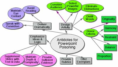
Antidotes
for Powerpoint Poisoning
Click on an item in the diagram below or on the list below.
If we expect students to complete quality work with depth and style, we should show them examples of excellent student work on related tasks or challenges. While there is always the danger of imitation and template thinking, students respond well to seeing a range of products and performances modeling a combination of good thinking with appropriate uses of technology.
In addition to providing examples of good work, we make use of rubrics to clarify our expectations. The following rubrics designed for a national contest outline expectations across more than ten issues:
Originality
|
1
|
2
|
3
|
4
|
| The work is a minimal collection or rehash of other people's ideas, products, images and inventions. There is no evidence of new thought. |
The work is an extensive collection and rehash of other people's ideas, products, images and inventions. There is no evidence of new thought or inventiveness. |
The product shows evidence of originality and inventiveness. While based on an extensive collection of other people's ideas, products, images and inventions, the work extends beyond that collection to offer new insights. |
The product shows significant evidence of originality and inventiveness. The majority of the content and many of the ideas are fresh, original, inventive, and based upon logical conclusions and sound research. |
For the full text go to http://www2.ncsu.edu/ncsu/cep/midlink/rub.multi.htm
Student performance is likely to improve by reading over such rubrics in advance. It may also prove effective to engage students in then writing their own rubrics with teacher support and guidance.
Presentations should be more about ideas than flash. 
If students are conducting research into a problem or issue - if they are exploring an essential question - then we should monitor the proportion of time devoted to research and thinking in contrast to the time spent preparing slides.
In some cases, students may do a glib and superficial job on the problem solving and decision-making in order to rush into the multimedia production phase of the project.
| Research and thinking should comprise something like 80 per cent or more of the total project time for most questions worth exploring. |
|
|
Research = 80%
|
Presenting = 20%
|
We need to communicate such expectations clearly to students from the start of the project, indicating that each student will maintain a research log listing times and activities.
Once students have built answers, created solutions or fashioned decisions and recommendations, they may turn to the stage of sharing findings. At this point, the focus should be upon persuasive communication of content.
1. Maintain Depth & Complexity
Real problems and choices deserve thorough, thoughtful analysis.
Take, for example, the online professional development challenge, "Engaged Learning, Writing and Thinking: A River in Trouble?" (see modules at http://fnopress.com/bigsnake/index.htm)
Teachers spend three days exploring the challenges facing the Snake River. Snake River salmon are on the Endangered Species List. One agency (the EPA) wants the dams pulled down to protect the salmon. Another agency (the Army Corps of Engineers) thinks the dams should stay. They claim they are good for the salmon.
The teachers are expected to prepare recommendations for a newly elected President of the United States. "What should we do about the Snake River?"
When studying this river and its problems, it is tempting even for adults to fall into one of two camps:
|
1. Remove the dams
|
 Public Domain Photo
from Army Corps of Engineers
|
|
2. Leave the dams
|
 Public Domain Photo
from Army Corps of Engineers
|
The range of policy options is much more complicated and considerably more diverse. It turns out that there are more than a dozen dams, some of which belong to the Federal government and others of which belong to utilities. It is far too easy to fall into the "all or nothing" perspective. One option is to take dams down partially. These middle range options can fall out of consideration as research teams begin to take sides and focus on building a clear, sharply delineated case.
Given the gridlocking potential of conflicting interest groups, a review of mid range options is critical in order to find common ground.
In this simulation, it may be appealing for the participants to seize upon the purity of an absolute position, while a president, a senator, a utility, a farming association, a group of Native Americans or an environmental group must be able to sit down at a table with disparate groups and perspectives, considering options within a context of compromise.
We teach a poor lesson in citizenship if we encourage or allow young people to erase or ignore the gray areas of public policy where real decisions are usually made and real solutions are lost or found.
"Tell that to the dying salmon," one might argue, but the salmon deserve something better than gridlock. If advocates of change fail to win any progress, they may have maintained ideological purity at the expense of the species, the people or the cause for which they are fighting.
One's approach to this project is likely to differ dramatically if there are as many as three products expected by the end instead of relying upon a PowerPoint™ presentation:
- A thoughtful, carefully argued position paper or essay written in a word processing program
- A set of presentation slides summarizing key points and arguments
- A persuasive personal oral presentation expounding upon and elaborating upon (not simply reading) the points listed in the slides
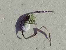
If the only product is a slide show, the software can subtly channel teams toward compression and oversimplification. The very physical nature of slides can lead toward a kind of fragmentation and deconstruction of an argument. We may end up with a trail of segments and bits and pieces instead of a carefully constructed arch way standing in clear view.
In place of sentences and carefully constructed paragraphs, we start writing phrases. Big ideas appear on their own slides. Details appear on their own slides. We may lose sight of the big picture. We move from stepping stone to stepping stone, unaware of the garden around us. We move from bead to bead without seeing the necklace. We lose touch with context. Out of sight is out of mind?
|
|
As with these shells, meaning may be obscured or may be enhanced by the type of display or the arrangement of ideas. |
| The software may, if we are not careful, actually frustrate the weaving process necessary to build ideas and construct meaning. It may, in the worst case, actually lead to deconstruction of meaning. |
|
Instead of weaving ideas and evidence in a coherent manner with transitional words related to logic and sequence, the word "transition" comes to mean the way that slides move from one to the next. We lose linkages and connections.
We would expect students to explore the complexities and deeper aspects of any issue in a conscientious effort to find the truth. We hope that they will not rush to judgment, oversimplify or make hasty conclusions based upon a cursory examination of the situation.
We must do what we can to combat Mentalsoftness™ - the tendency to settle for clichés, bromides and platitudes rather than conducting an earnest, probing investigation (see FNO, May, 2000 - http://fno.org/may2000/beyondinfo.html).
This goal may be more of a challenge than most teachers recognize when they launch their first PowerPoint™ assignments.
The software can easily become an end in itself as students start to focus early on the slides they intend to produce.
2. Provide Sufficient Evidence
How much evidence do students need to present to establish a thorough and complete case, to cover all the issues and dimensions of a challenging question? What is sufficiency? Adequacy? The answer depends upon each issue or question. Some will require far more than others.
We recognize that extensive evidence does not fit comfortably into the simplicity of computer slides. We are looking for weight, perhaps even a mountain of convincing ideas, arguments and data. The slide presentation is like the tip of an iceberg. We expect to find a solid foundation substantiating the case being made.
We hope to see a carefully constructed argument tied to convincing examples. We also expect to see the counter arguments and alternative theories laid to rest or discredited by the offering of facts or evidence or arguments that show their inadequacies.
 |
The need to provide evidence leads to the next strategy. While programs like PowerPoint™ provide a box to add notes to accompany each slide, these notes are separated from each other and can hardly serve the function of presenting a carefully articulated argument or a fluid presentation of evidence.
|
3. Supplement Slides with Text & Data 
If we think of PowerPoint™ slides as visual summaries of findings to supplement an oral presentation, we would expect to see accompanying such slides a carefully constructed essay or argument developed in a word processor, laying out the key ideas in considerable detail and depth.
We see little discussion or writing about the differences between reports that are constructed within each of these software contexts, and yet the pressure is on to make frequent use of presentation software as evidence that the technology dollars have been well spent.
When we examine the scepticism and reluctance of many teachers to embrace new technologies, we are too quick to view their resistance as some kind of Luddite rebellion. In some cases, the resistance is grounded in a faith that it is no simple manner to teach students how to build arguments and construct meaning. Some teachers see a drift toward Mentalsoftness™ and cut and paste research that the new technologies may actually aggravate.
1. Consider Audience
Those who wish to persuade, those who hope to convince, those who wish to illuminate and those who wish to communicate effectively all must pay special attention to the audience who will be watching their slides, hearing their voices and listening to their words. The goal is to inform, enlighten and possibly even change someone's mind. The chances of reaching an audience are greatly increased if the presenter tries to understand the group and its characteristics . . .
Who will be sitting out there? What are their needs? Their preferences? Their attitudes?
How much do they already know? How much background is needed? Is there a real mix of styles so that multiple presentation strategies are required?
How much vocabulary can they handle and at what level of difficulty?
What strategies, examples and arguments will help them understand the key points?
2. Eliminate Distractions
Flashing slides with many different transitions, dazzling sound effects and gimmicks of various kinds can distract the audience from the argument being made or the evidence being presented. dazzling sound effects and gimmicks of various kinds can distract the audience from the argument being made or the evidence being presented.
Students must learn to settle for a few special effects and put most of their energy in persuasion. The best presentation is the most persuasive, not the most dazzling.
|
3. Select Powerful Images
|
 |
Much of the clip art commercially available to students is quite limited and limiting. We would expect them to use digital cameras and their own art whenever possible to deliver more punch and power to their presentations. We would also expect that they honor copyright when employing images scanned from the press or downloaded from Web sites, teaching them that "fair use" may allow such use by students within classrooms for reports but would not be permitted if they were adults in the workplace and is not permitted on school Web sites.
The importance of moving beyond clip art has been explored at some length in previous issues of FNO (June, 1999, "Beyond Clip Art: Encouraging Children's Own Drawings" and April, 1999, ""Template Art, Template Thinking, MultiMediocracy and Other TomFoolery."
4. Distill Words
Slides are meant to share main ideas, phrases and key points. The student first expands upon these main ideas in an essay fully substantiated with evidence as mentioned earlier in this article. The slide presentation is a summary or abstract of this longer, more carefully elaborated piece of writing.
Slides should rarely offer more than a dozen words each.
Students should prepare to speak concisely and effectively to a group about the ideas represented by the slides. They should not read the slides to the group.
5. Honor Criteria
Artists and those who write or speak for a living usually devote considerable energy and attention to design criteria. Even if they violate design values, it is usually in some conscious manner to create a special effect. It is unlikely that most students will apply such design criteria to their own work unless the teacher takes the time to teach and demonstrate the criteria. Here again, exemplars can be an effective way to illustrate the power of good design.
Students will be most effective if they consider and address values such as the following:
Harmony

|
How well do the elements (ideas, images, sounds, etc.) fit together? Are they resonant? dovetailed? matching? coherent? congruent?
If not harmonious, does the lack of harmony help to create meaning, as with juxtaposition or cognitive disssonance? Is the discordance intentional and functional? Or is it jarring? Mere noise and static?
|
|
|
Is the scale or relative importance of the elements in keeping with their importance? Do big ideas appear in larger fonts than details? Is the size of the graphic appropriate in relationship to the words?
Templates - because they allocate a certain amount of space for text and a certain amount of graphics - can sometimes skew the emphasis placed on one part of the slide. Inserting images into predefined spaces tends to expand them to fill all available space. Students should decide how big these items should be in advance and should give them the space on the page their value warrants.
|
|
|
Do the elements of the page stand together visually? Or do they seem likely to "fall down" or topple? |
|
|
Have various devices and special effects been used judiciously so as to contribute to meaning? Do choices of fonts and styles match intention? |
|
|
Do the slides, the design and the ideas show signs of personal style and inventiveness? Or do they suffer from same-old, same-old, template design? Do the pages seem hastily constructed with a slap-dash, cut-and-paste approach? Or can we see a devotion to thoughtful, intentional design? |
This list of design principles is meant as an illustration. For more completely developed models, consult some of the following excellent and user friendly resources:
- The Non-Designer's Design Book: Design and Typographic Principles for the Visual Novice. Robin Williams, 1994, Peachpit Press, Berkeley, CA. ISBN 1-56609-159-4 This is a delightfully illustrated book demonstrating the power of proximity, alignment, repetition and contrast to increase communication power. Middle school and high school students would enjoy and understand this book.
- Creativity for Graphic Designers: A Real-World Guide to Idea Generation--From Defining Your Message to Selecting the Best Idea for Your Printed piece. Mark Olach, 2000, North Light Books, Cincinnati, OH. ISBN 158180055X This book, while aimed at adult design professionals, would work with middle school and high school students as a way of helping them to push their ideas toward originality. Divided into three sections (Preparing for Ideas, Getting to Ideas, and Growing Ideas), this book provides excellent suggestions for communicating with pizazz and freshness.
There is an ever present danger that the excitement of creating multimedia slides and presentations will distract students from the very real and difficult challenge of addressing a human audience, face-to-face, eye-to-eye.
The goal is the creation of a strong and charismatic relationship with the audience. Students must master strategies to develop and maintain contact, engagement, credibility and trust.
It is a rare and very remarkable software presentation that can stand alone without any live and present human contribution. Students must be taught the skills required to convert a slide presentation into a winner. Some day they may be selling an idea to a boss, trying to convince a Planning Board or testifying before Congress. They can ill afford to stand and let the software speak for them.
Much depends upon the manner with which personal qualities are communicated. If character and sincerity accompany the words, the audience is less likely to dismiss the presentation as mere rhetoric.
Eloquence is clearly associated with more than skillful oratory. The human touch is an essential ingredient.
|
A [person] may lack everything but tact and conviction and still be a forcible speaker; but without these nothing will avail. . . . Fluency, grace, logical order, and the like, are merely the decorative surface of oratory.
- Charles Horton Cooley (1864-1929), U.S. sociologist. Human Nature and the Social Order, ch. 9 (1902). The Columbia Dictionary of Quotations.
|
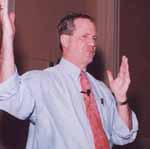
1. Maintain Eye Contact
The effective speaker creates a strong connection with the audience by establishing eye contact with each member of the audience at various points throughout the presentation. This contact is more difficult to achieve as the size of the audience expands, but most classroom groups will be under 30. The speaker is not just looking audience members in the eyes. Contact requires a deeper connection, a two way interaction that involves an exchange of energy.
If the speaker is reaching the audience member in a convincing and engaging manner, there are likely to be signs of approval coming from the eyes of the listener along with body language such as nods of approval, agreement or excitement. If, on the other hand, the speaker is being confusing, boring, abstract or flat, there are likely to be signs of disapproval.
The good speaker learns to read these signals and signs in order to modify the presentation. Seeing confusion, the speaker gives examples and simplifies the message. Seeing boredom, the speaker tries to add sparkle, reduce abstraction or use vivid examples or stories. Seeing interest, curiosity and enthusiasm, the speaker carries on with the style already working.
In most audiences, the reactions may vary across the group. In order to reach the widest possible number, the speaker scans the faces and tries to figure out who still needs convincing. The best presentations are dynamic, responsive and organic, not canned.
2. Avoid Reading Slides Aloud
Even though most people have a strong aversion to sitting while someone reads aloud a paper or a series of slides, the practice persists with remarkable resilience in many places. Powerpointing adds what may be an even worse version of this practice - the audio recording with students reading aloud the words on slides so that their voices come across canned as part of the presentation. In this event, students can set the slide presentation on automatic and sit back while the computer takes over (badly).
The words on slides are meant as talking points and headings. We should trust the audience to read them without our help and turn our own efforts toward elaboration and exploration in a fresh voice that reaches out into the room warmly and sincerely. Digital recordings are rarely as good as live student voices.
3. Speak with Conviction
To establish credibility and trust, the speaker must deliver sincere beliefs in a convincing manner. We're not talking about "virtual sincerity" - the mere appearance of conviction.
It is true that demagogues have mastered the techniques of "virtual sincerity," but we would hope for something much better from our students. This is not about manipulation or appeals to fear. This is not about artificial techniques.
Can we teach our students the difference? It seems to be an essential aspect of citizenship - the ability to recognize and debunk the falsely sincere and manipulative speaker, the glib presentation, the eye candy and mind candy of the marketing whiz. The goal of this article is to show ways that students can avoid Mentalsoftness™ and learn to think and communicate thoughtfully.
|
The American Heritage Dictionary defines glib as follows . . .
(glîb) adjective
1. a. Performed with a natural, offhand ease: glib conversation. b. Showing little thought, preparation, or concern: a glib response to a complex question.
2. Marked by ease and fluency of speech or writing that often suggests or stems from insincerity, superficiality, or deceitfulness.
Synonyms: glib, slick, smooth-tongued. The central meaning shared by these adjectives is "being, marked by, or engaging in ready but often insincere or superficial discourse": a glib denial; a slick commercial; a smooth-tongued hypocrite.
|
|
 From Now On